
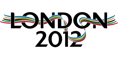
Now, it is eyecatching, but it really looks like some talentless amateur has been let loose with the 4-pen pack of Platignum felt-tips.
I find it impossible to to imagine that this thing took more than 400 seconds to create. Even the typeface for "london", not even capitalised, is an utter disgrace. It has all the artistic and creative merit of one of those "jokey" office posters written in "MS Comic Sans" with one of the crushingly predictable pieces of "clap art". Frankly, I am surprised that it did not include the "bending man with magnifying glass" image so often seen in talentless materials.
What is really sad is that some chum has had the hubris to trademark this nonsense. Thats another £140 down the drain, then.
The logo for the bid is infinitely less-worse:-
Ok, so it is not as "eyecatching", but if you want eyecatching, may I suggest a pic of Tessa Jowell's rancid head on a spike. That would raise a cheer, at least.


2 comments:
Tessa Jowell's head on a spike ... brilliant!
Since I got infected with the Lisa Simpson meme (Hat tip to samizdata.net) I can't see it any other way. Argh!
Post a Comment